Design Brief: Create a set of two different posters for different audiences about a randomly assigned topic. Due to the nature of this poster being an infographic, there needs to be information relevant to the topic and proven to be statistically accurate.
We were given the choice on how to approach the topic we were given, of which I chose to go with a call to action for one and awareness for the other. The two target audiences were women, aged 25-36 (the widest demographic who report domestic violence/abuse) and young men aged 18-24 who may be living on their own for the first time.
Design Finalized November 2024

Sources Used:
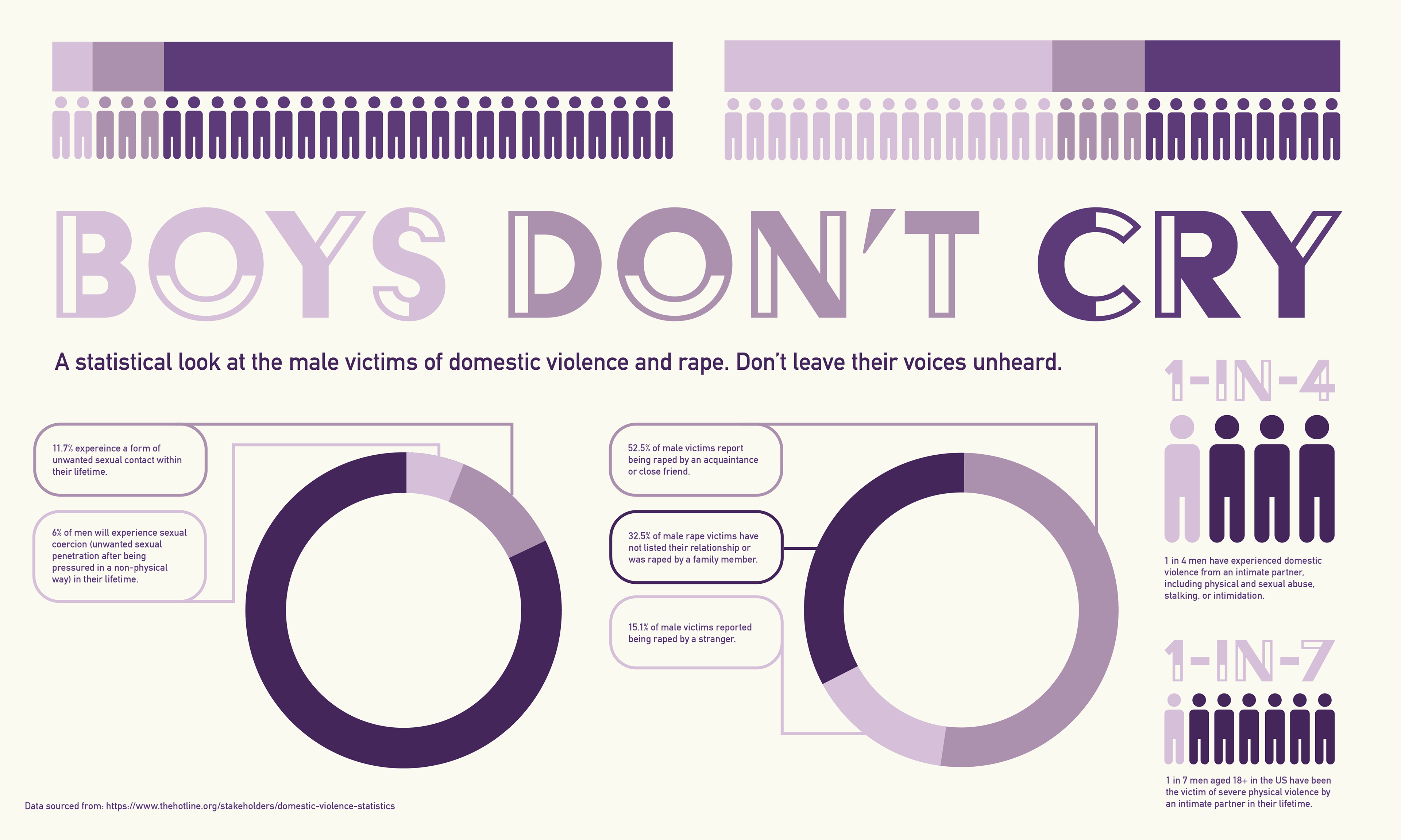
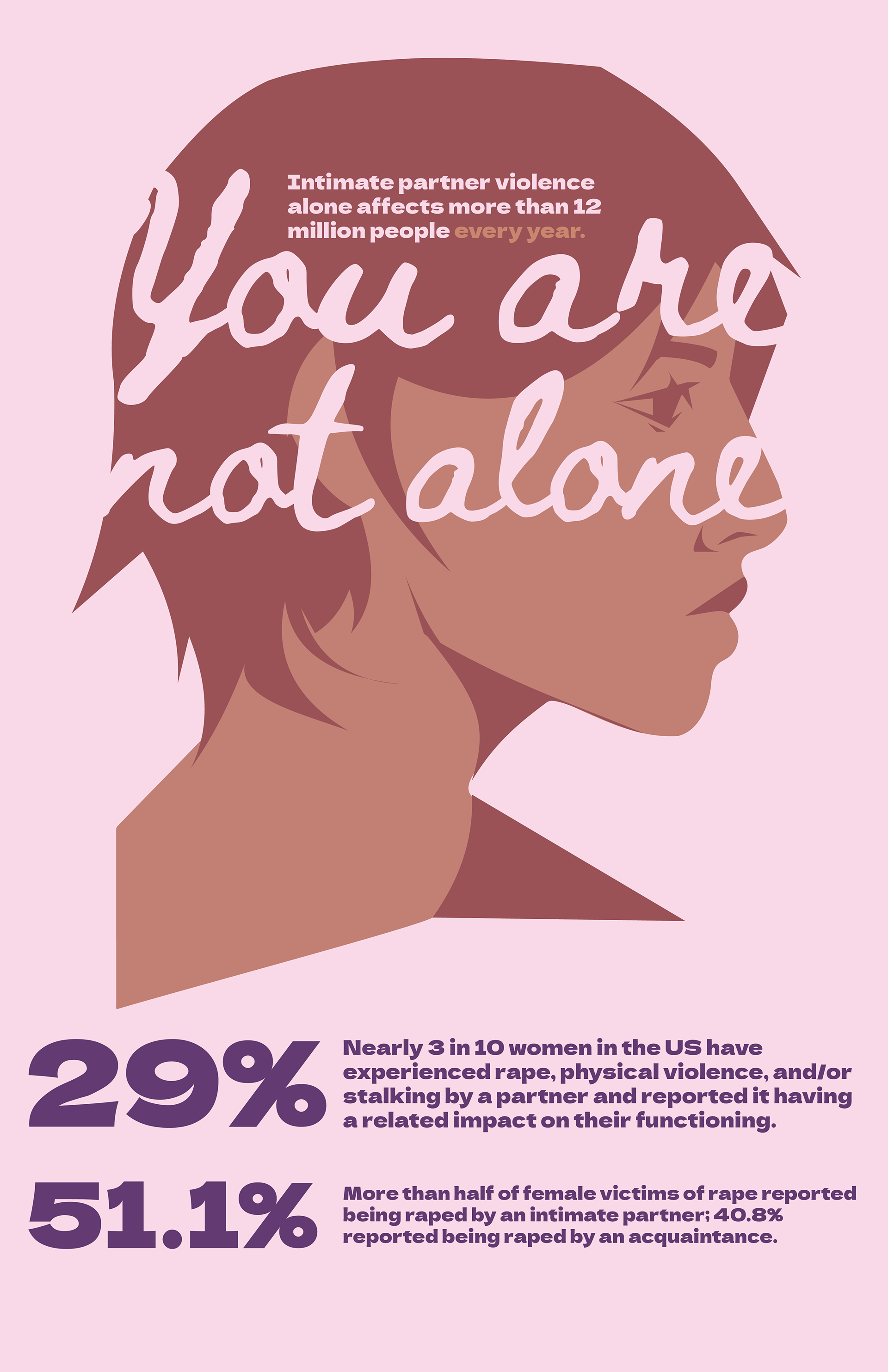
The National Domestic Violence Hotline – Contains statistics about domestic abuse rates for men and women in the United States, as well as serves as a resource guide for those who are struggling in an abusive situation. All of the statistics for this project were collected from here–the site also listed the original sources that they gathered their data from.
Love is Respect – An option if I decided to do a “know the signs” poster, although that idea was forgotten.
Sketches, Early Planning, and Final Type

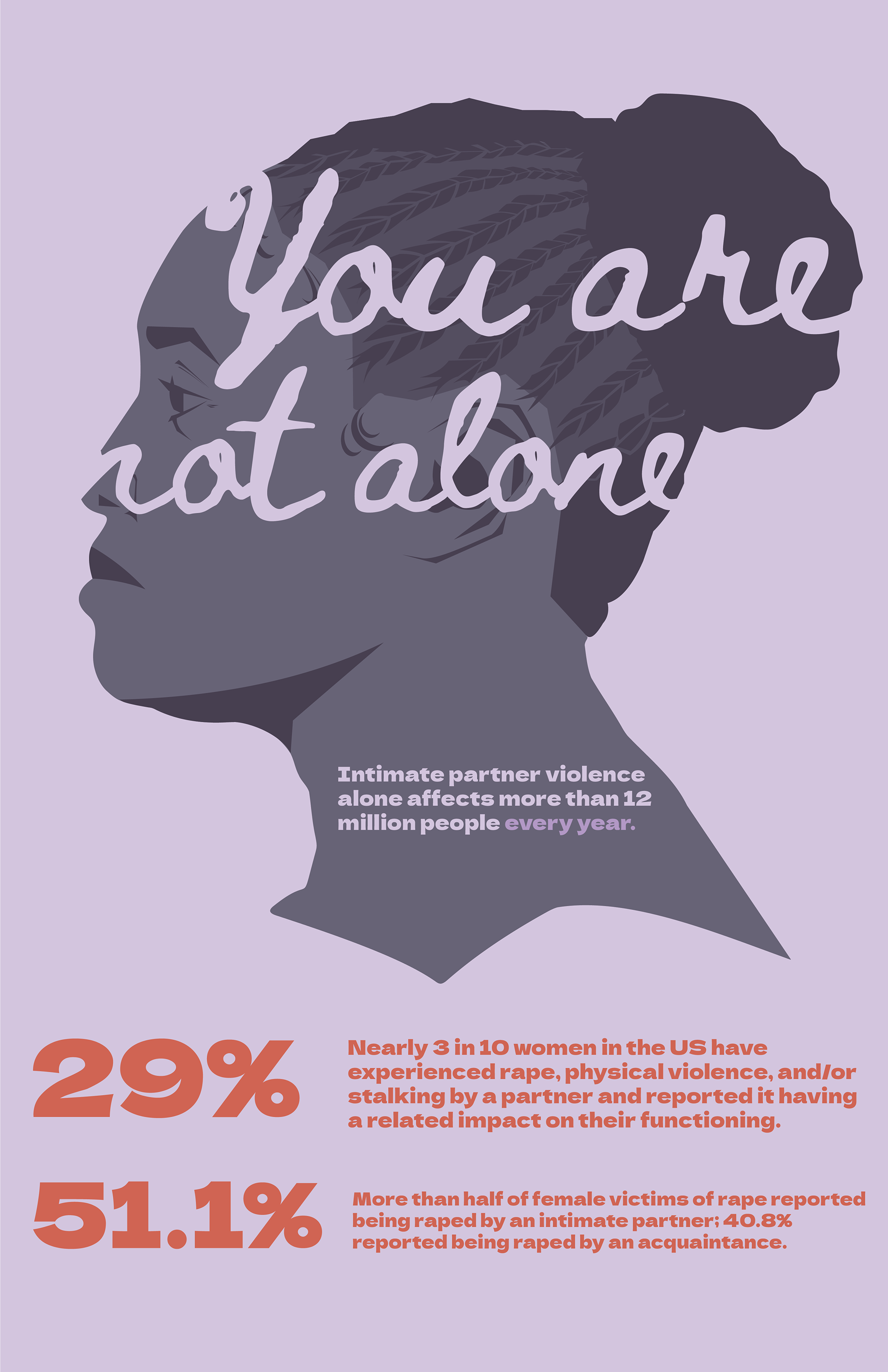
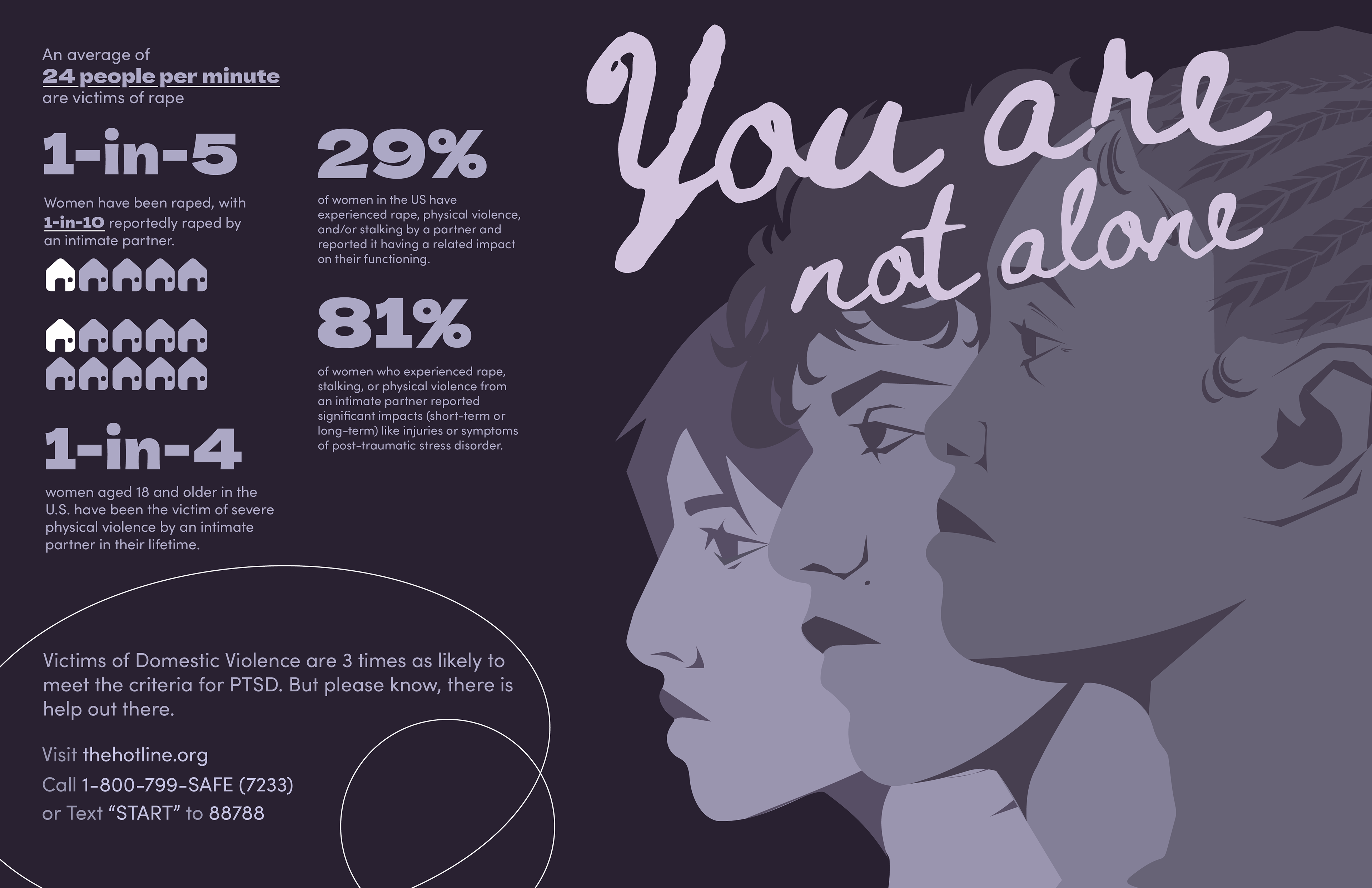
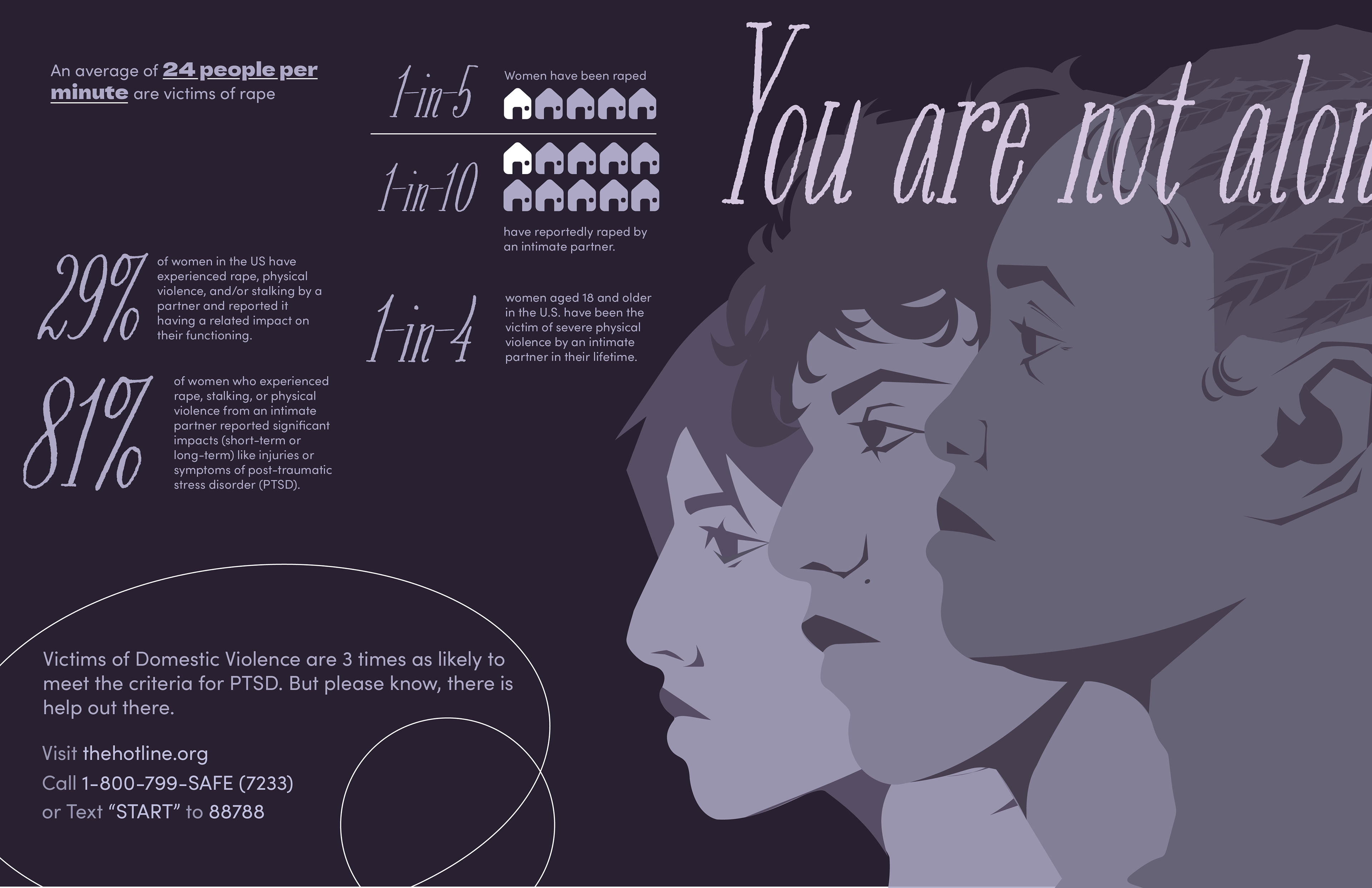
You Are Not Alone
I knew right away that I wanted the focus to be on using faces as imagery, although the approach changed as I continued working on it. I originally wanted independent posters, and potentially a group poster for rounding out the information for portfolio examples. I made each face in vectors and then compiled them in different ways until I was satisfied.
The information from my sources were compiled and tested in different formats to see what was the most visually appealing. I ended up layering the faces to create an imagery of solidarity and to directly work with the "you are not alone messaging, as well as create a dynamic visual compared to the more static text. I found it worked better in a landscape formatting, for both breathability and the ability to properly incorporate information, so I moved from portrait and landscape and continued building the design in that way. Finally, as my call to action message, I included a set of sources in the bottom that were highlighted in a subtle manner.


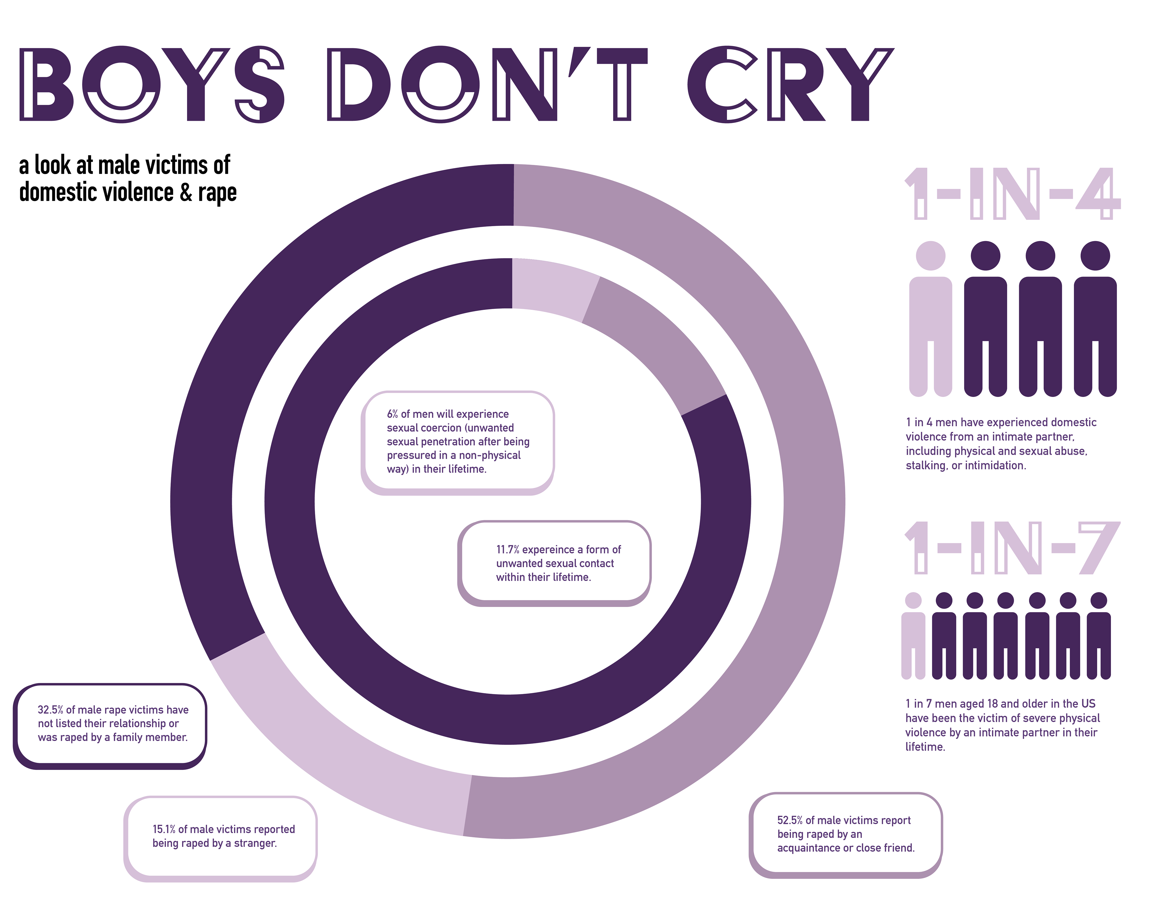
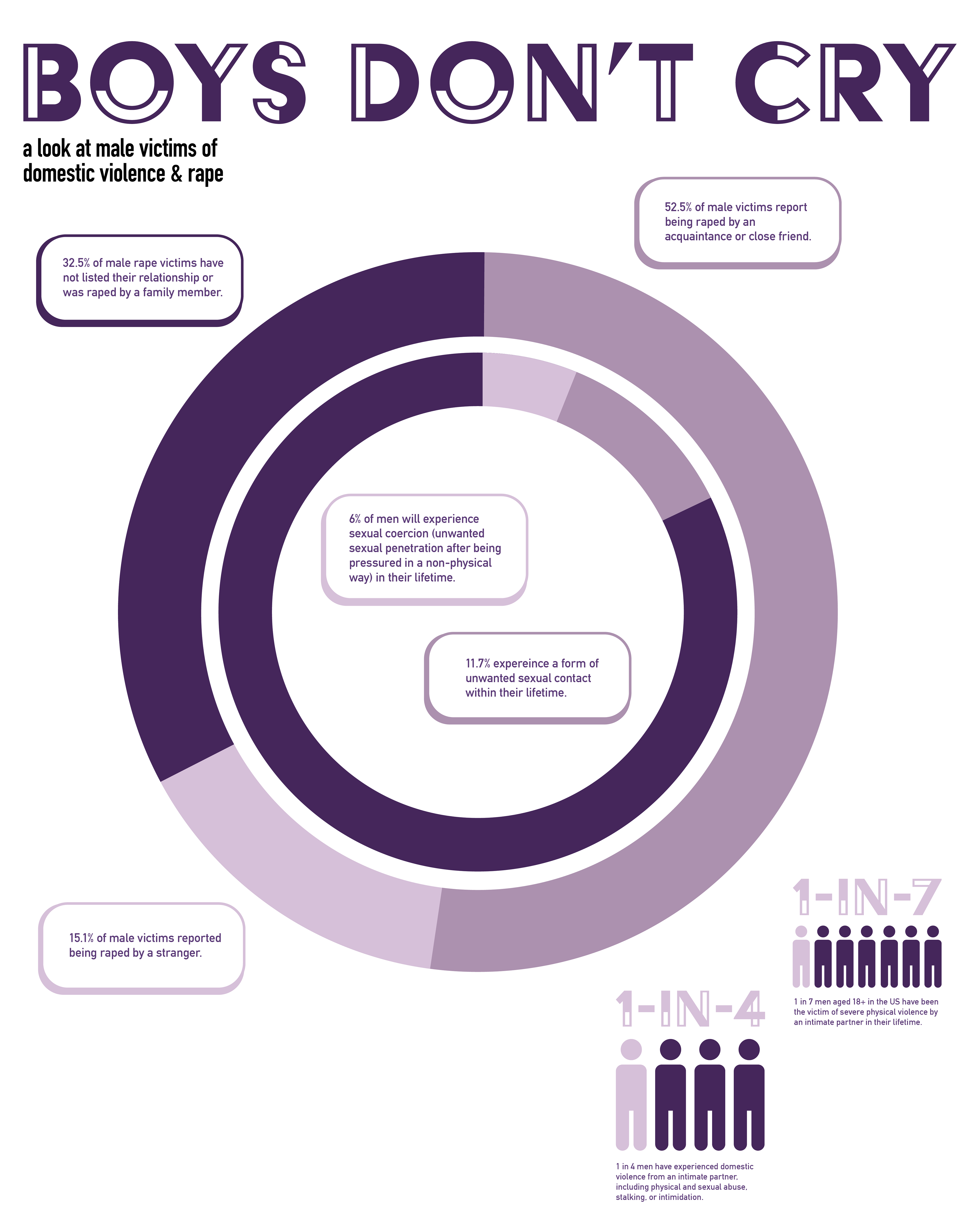
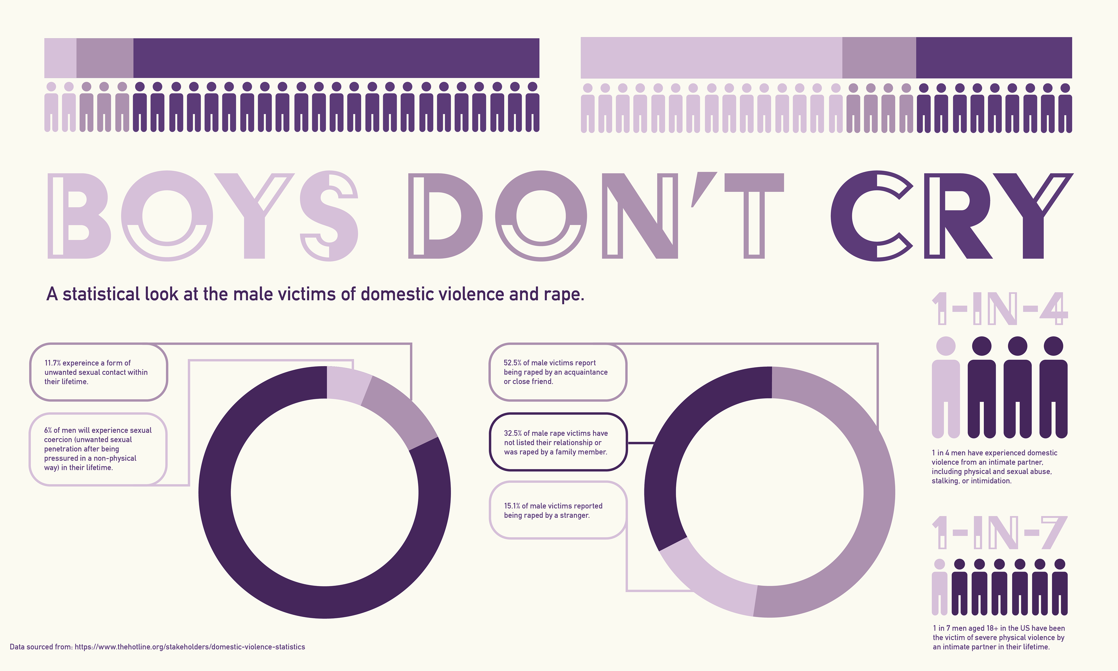
Boys Don't Cry
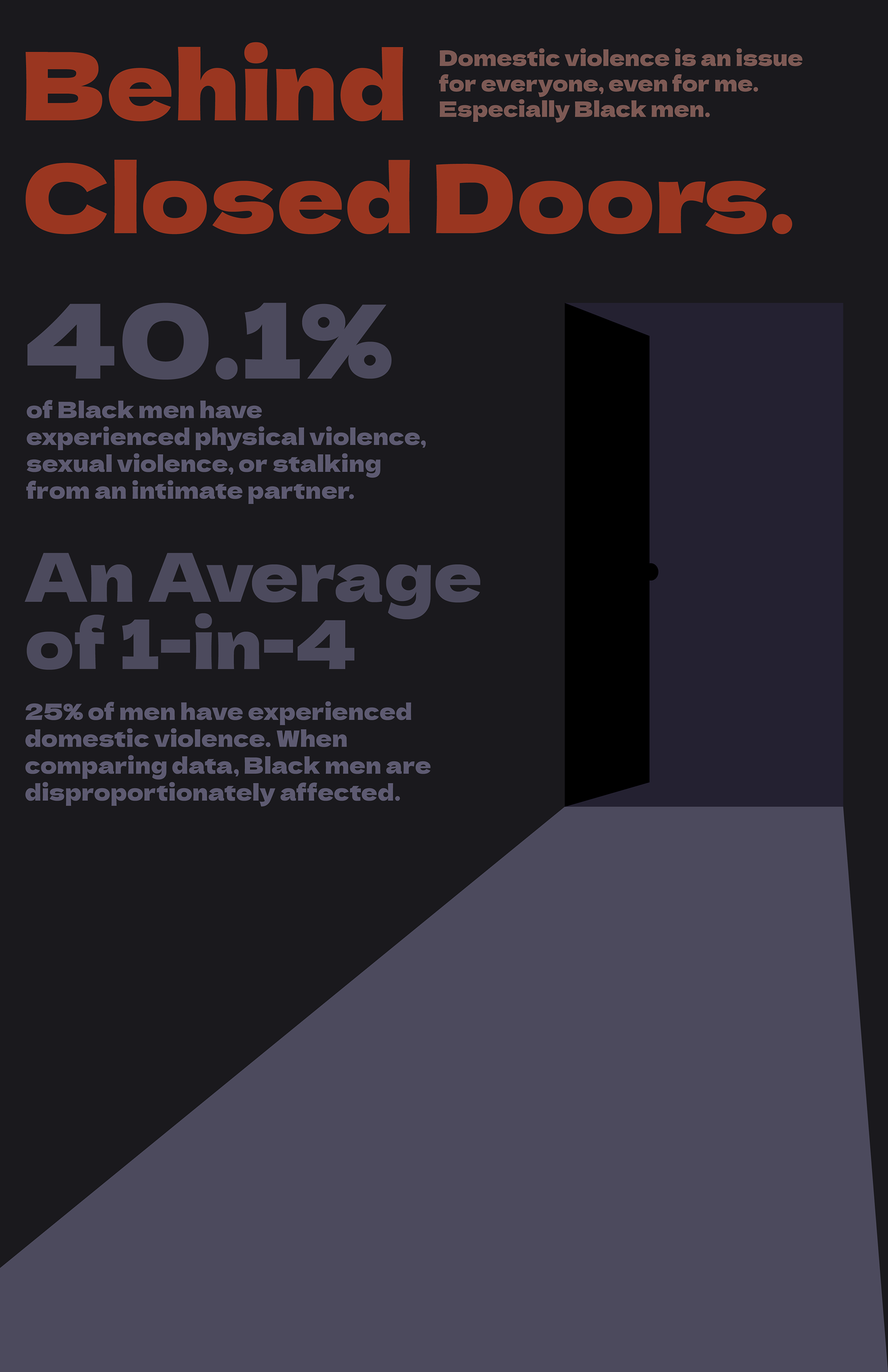
As an early approach to the topic, the most affected ethnic group was discussed as the target and statistical backing for this project. While these do show that data, most of what I was looking at before this was either vague when it came to individuals in the data set (ie, background, age, race). After a shifted approach, most of the specific data was harder to find, outdated, or not within the American demographic that I had in mind for this poster. Eventually, this approach was abandoned.
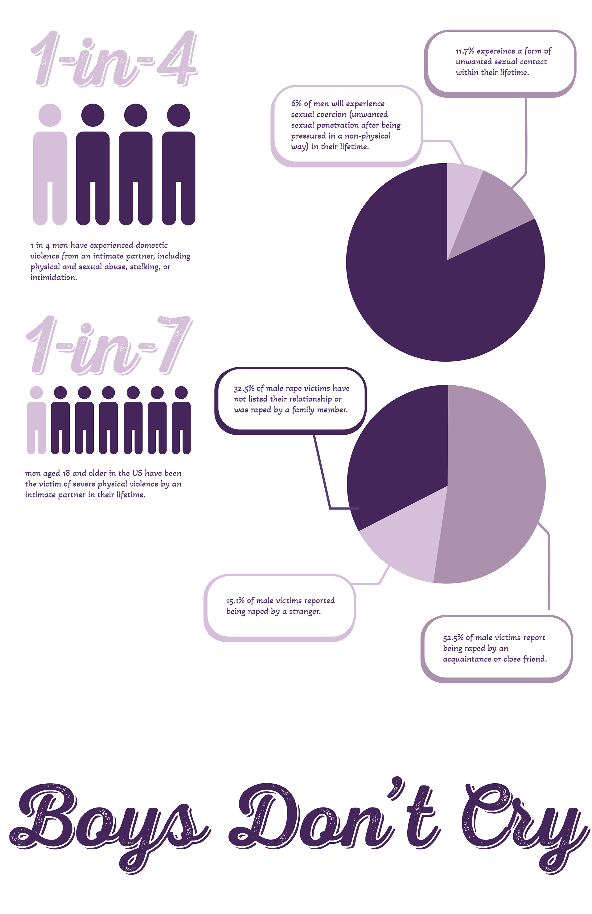
Deciding to move away from the more illustrative approach, I tried some new ways to explore a using less artistic and more statistic focused approach. Limited, but easy to understand graphics, the occurrence of a more predominant purple (for association with Domestic Violence awareness), and blurbs giving context felt like it boiled the information for it to be digestible while still getting these statistics across. However, it was difficult to find a balance between the type and the content, as well as how the content was balanced on the page.
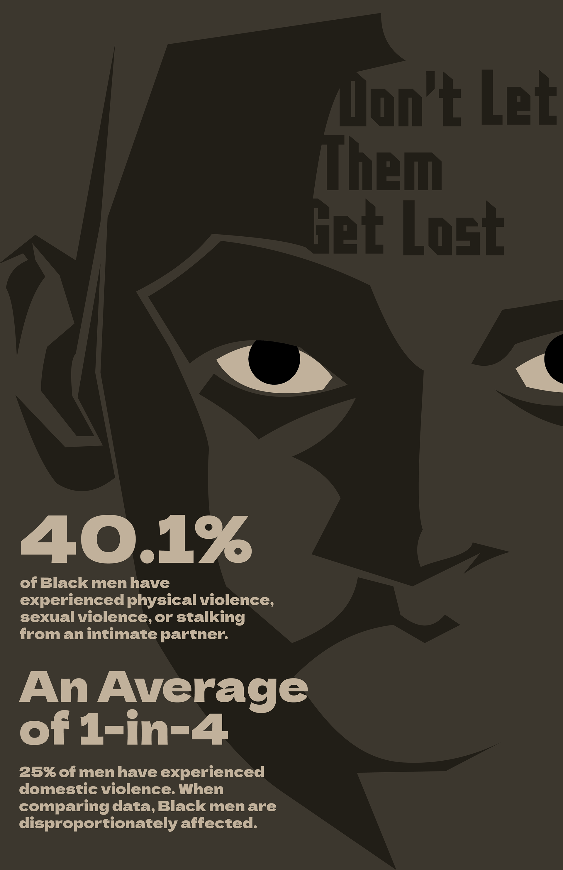
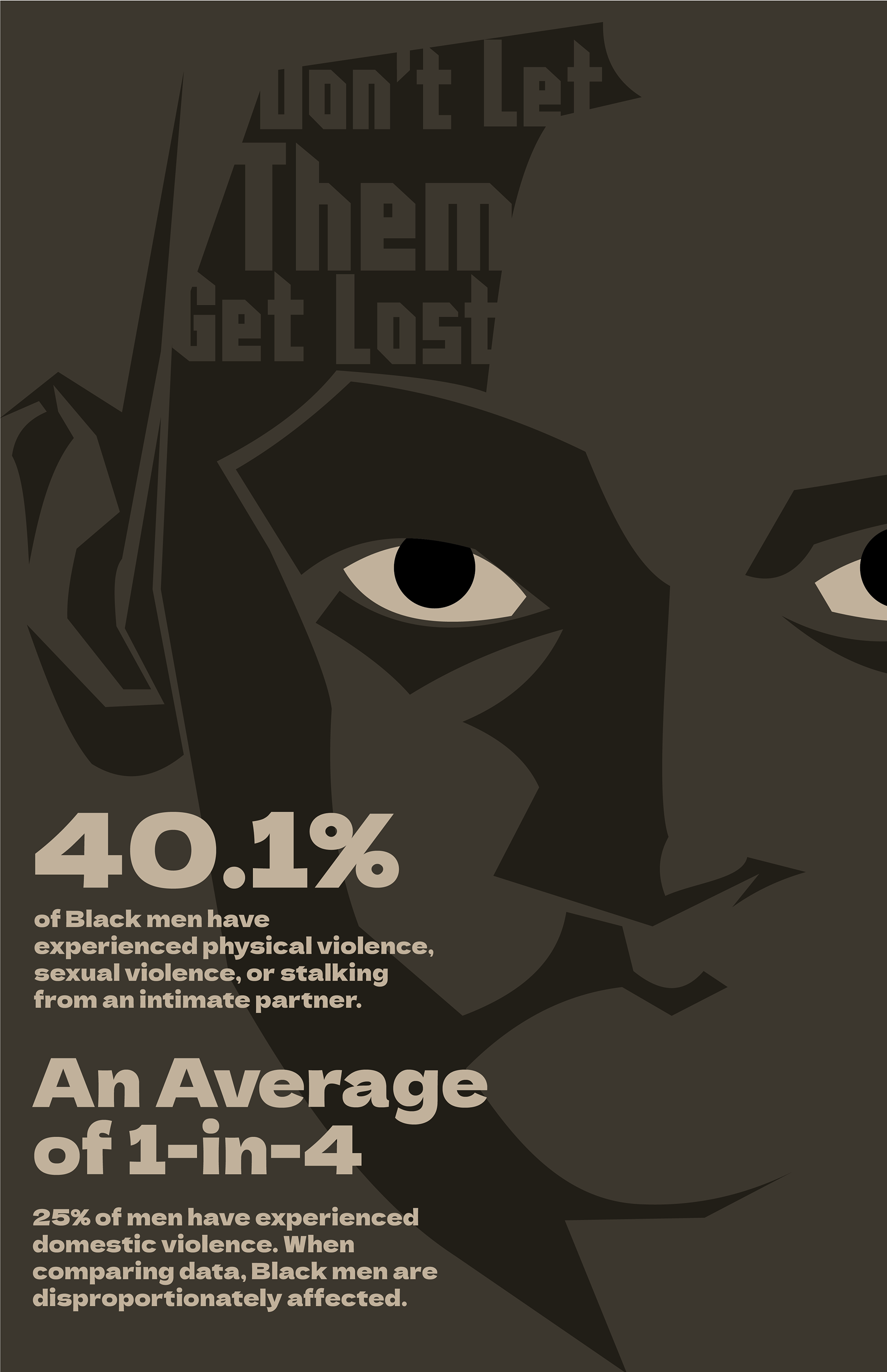
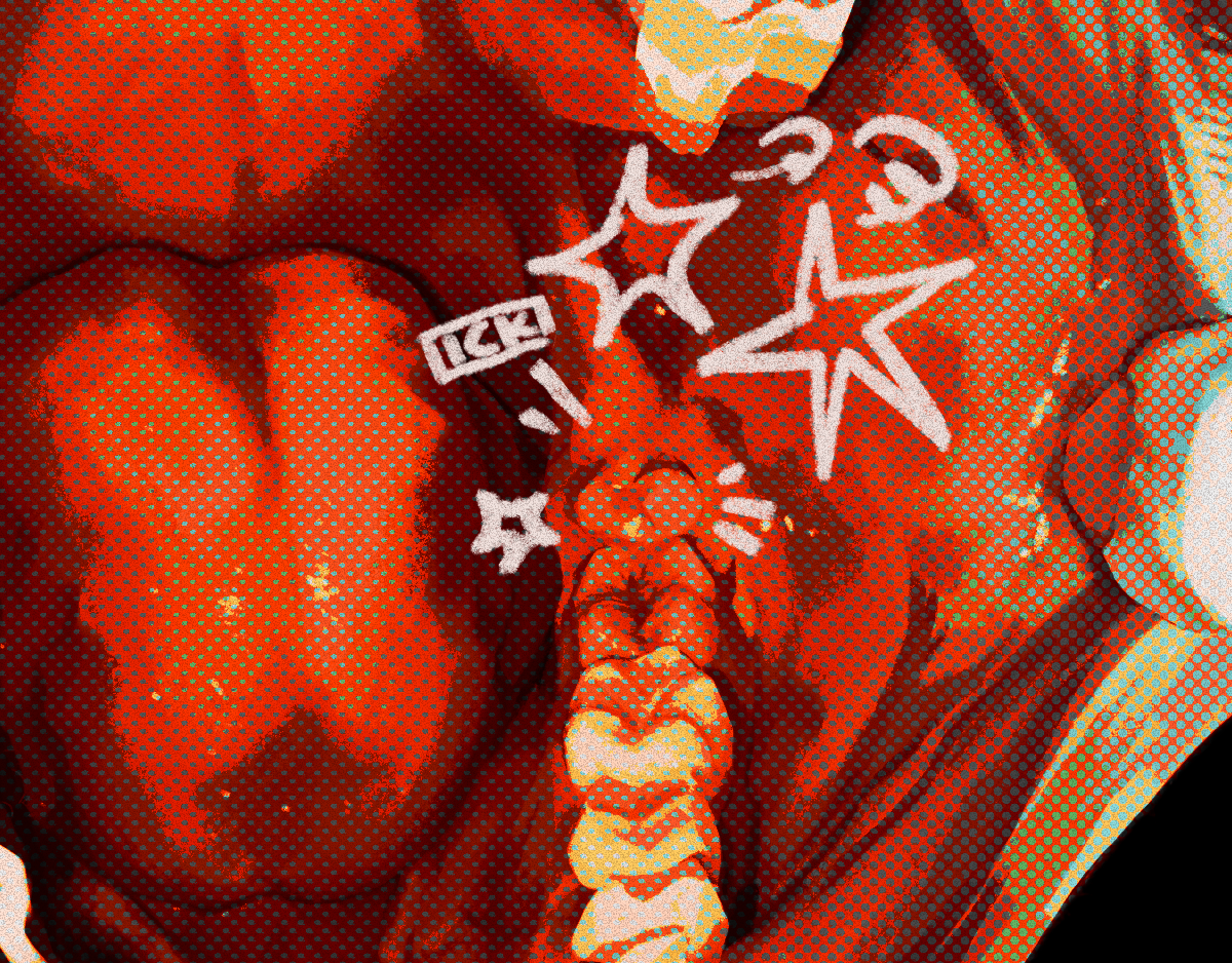
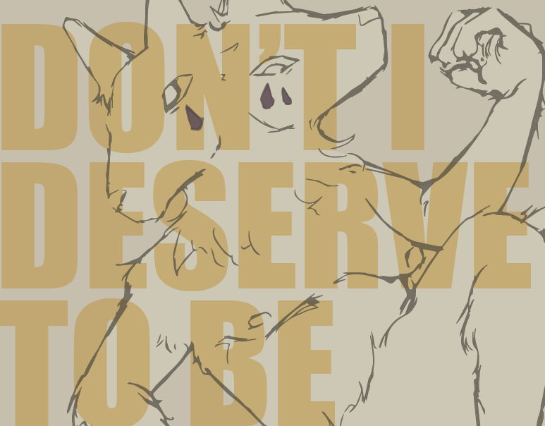
In terms of type, I came up with the “Boys Don’t Cry” idea to help invoke a feeling of fragility that men may feel they cannot present outwardly due to certain ideas projected onto them from a young age, a message particularity important to men who may be newly independent within the demographic I had in mind. I tried something new, but thought it felt “too soft” in comparison to the other visuals, but I didn’t want the typefaces to be the exact same across both posters.
Continuing to play with the same created isotypes, I moved them around to see how they would work well in different formats that weren’t working before. I wanted all of the information to remain the same and to be able to continuing to use the already created diagrams, so it was a matter of configuration and using the space in a balanced way.