"Fabrick" is the self-titled fashion magazine published by Rochester Institute of Technology's fashion club, Fabrick. With a mixture of interviews, interactive articles, and fashion hot-spots, the magazine has something for every fashion-forward individual on RIT's campus.
This volume of Fabrick follows the idea "Perspective." This makes my goal as the designer to emphasize the aesthetics and appeal that each of the three articles I designed for and designer in order to reflect their personalities and goals. By trying different techniques and approaches, I'm incorporating the different perspectives into a complimentary design.
Designs Finalized May 2024
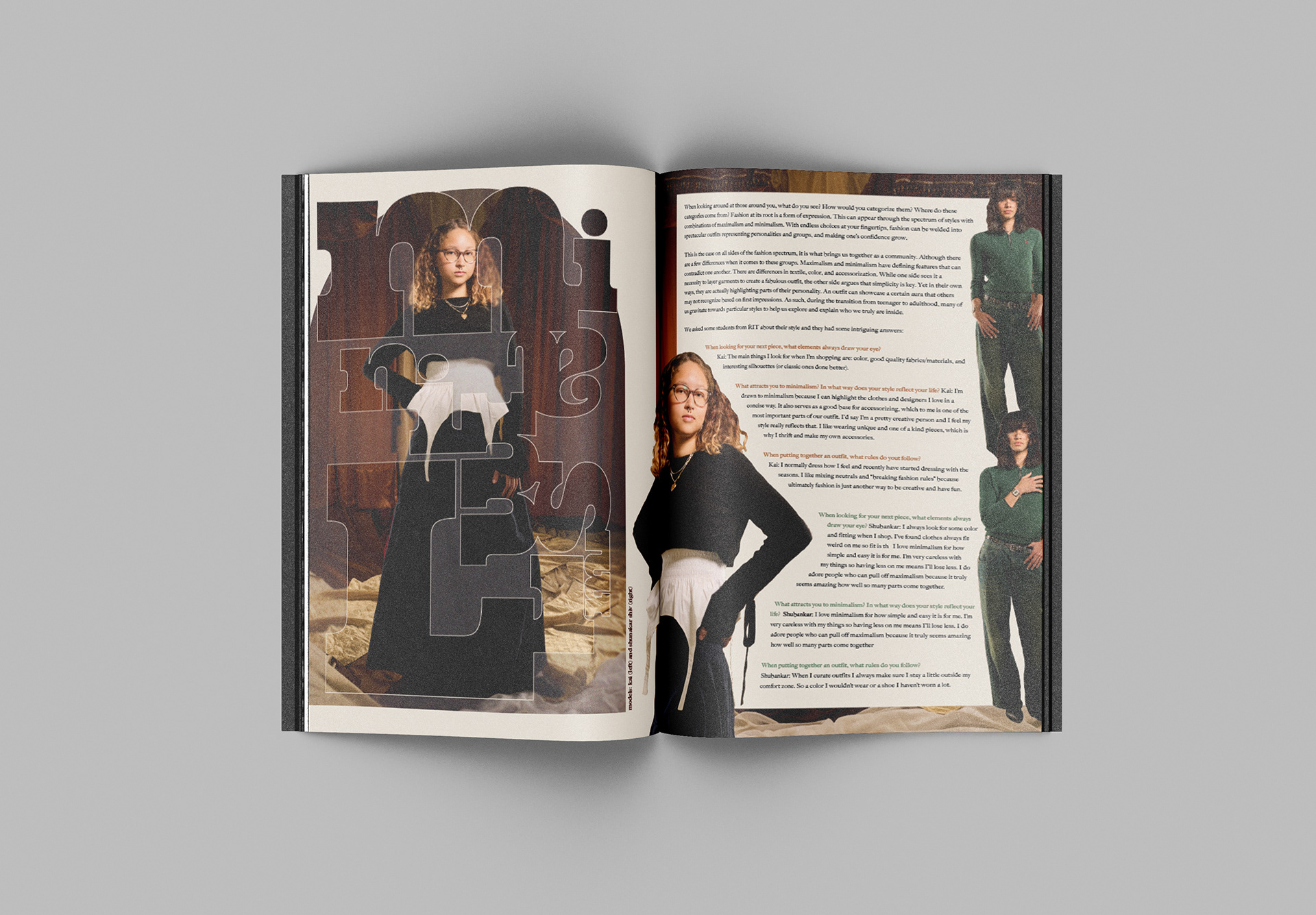

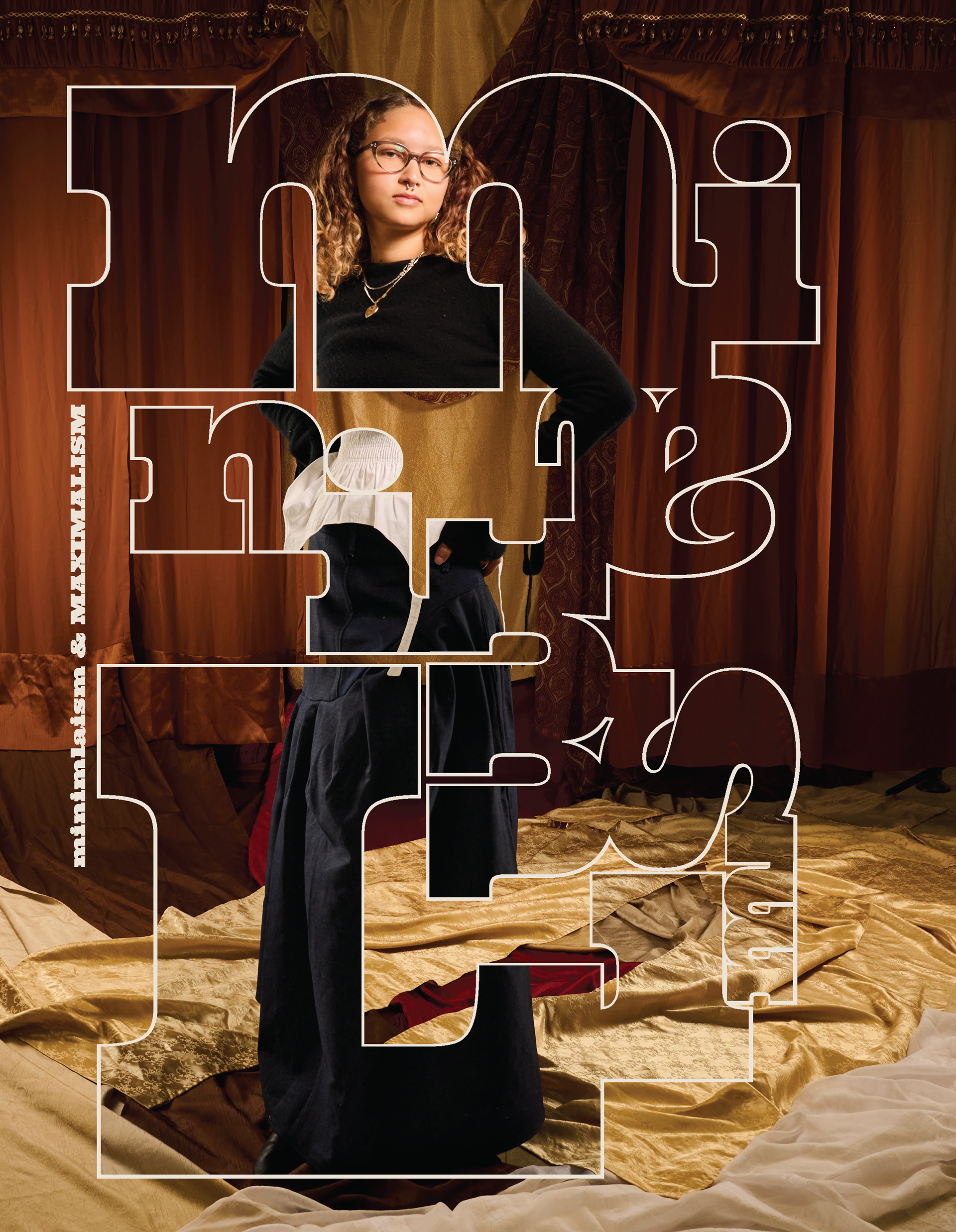
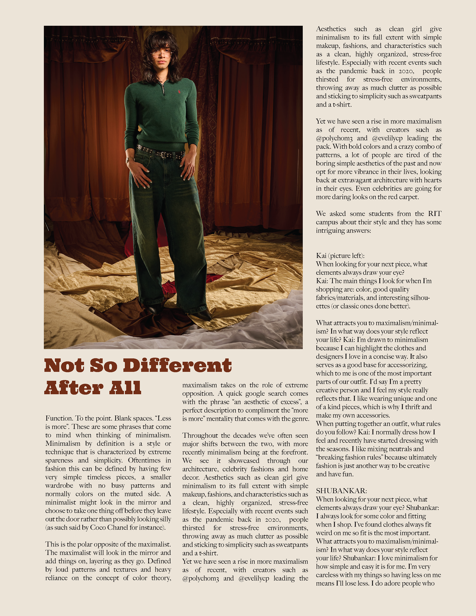
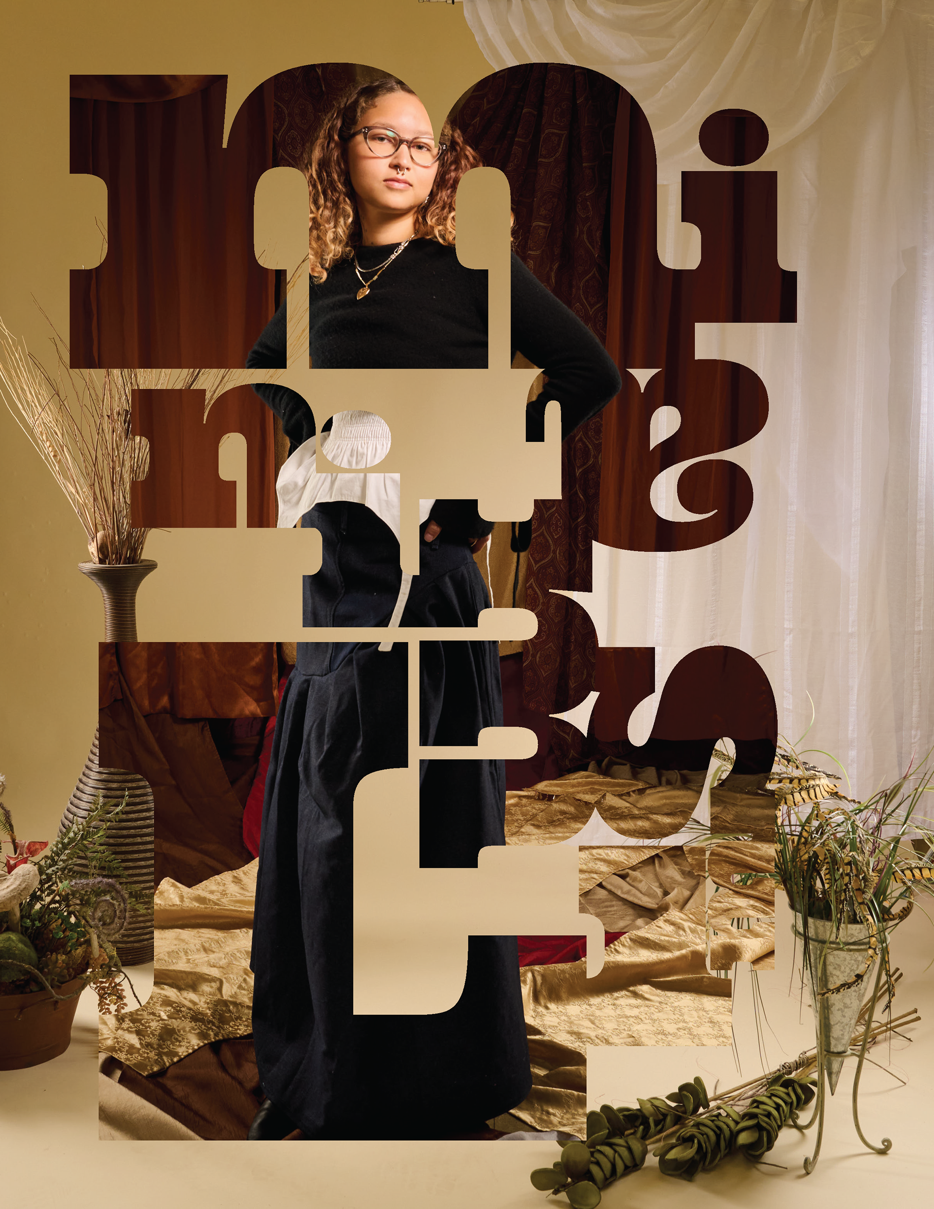
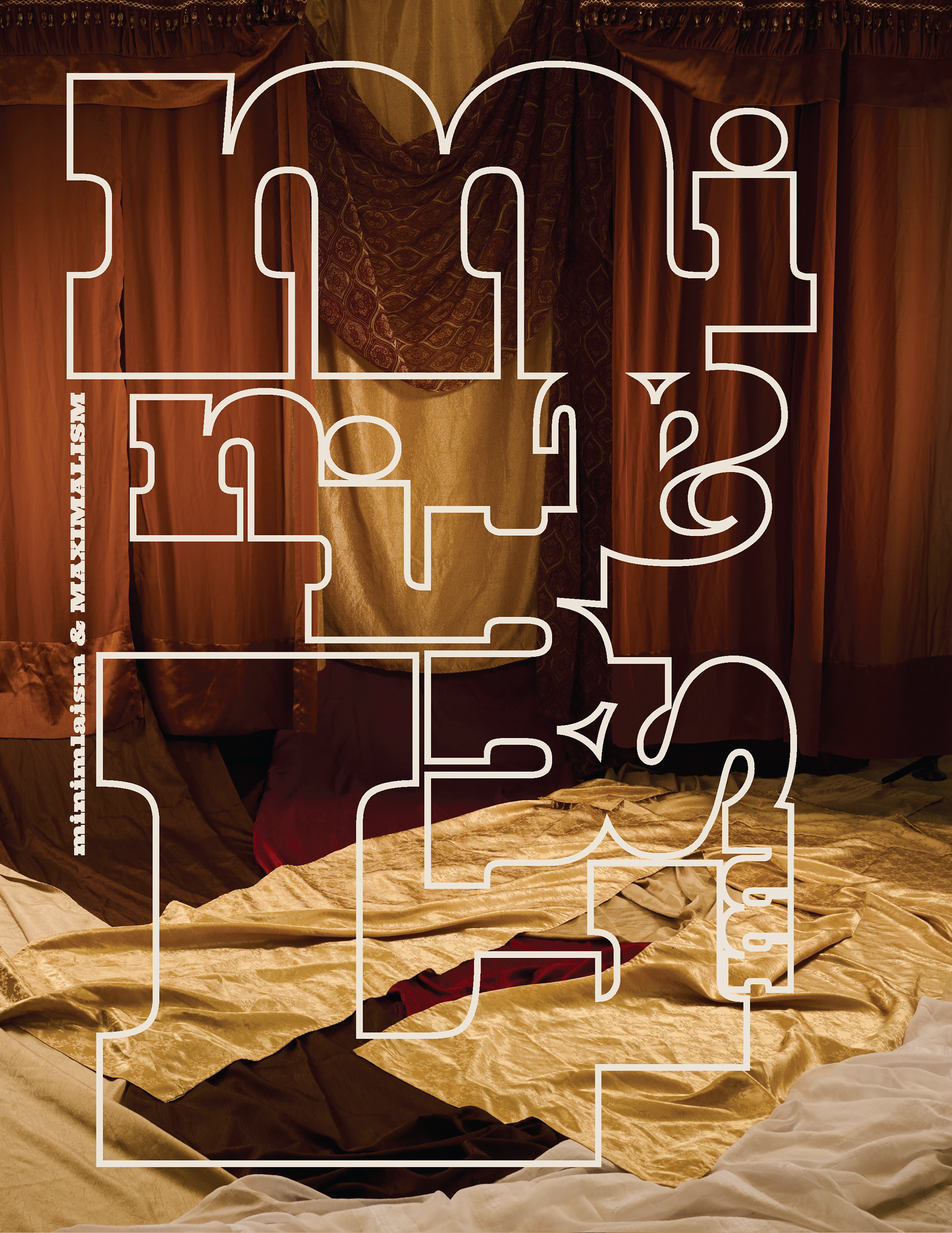
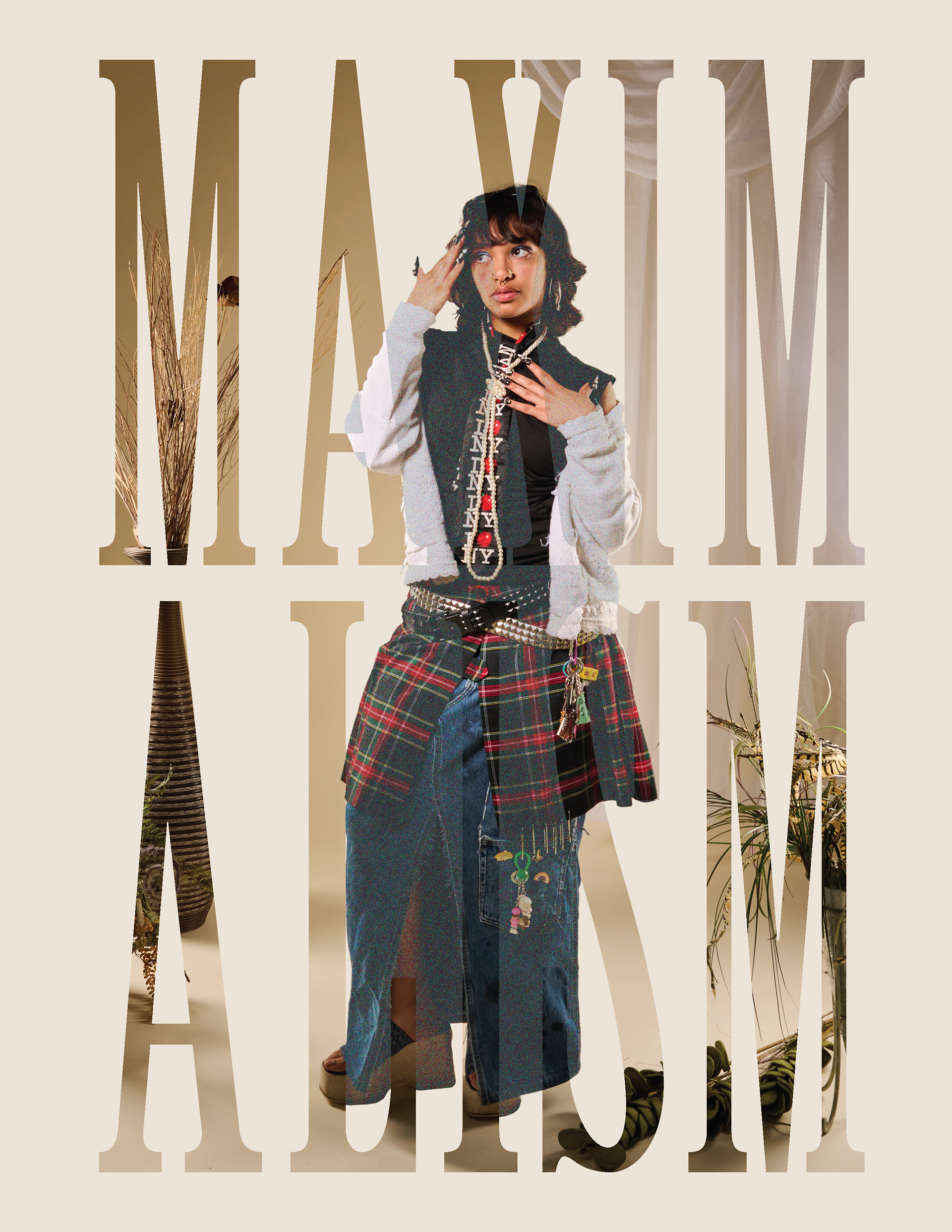
Minimalism//Maximalism
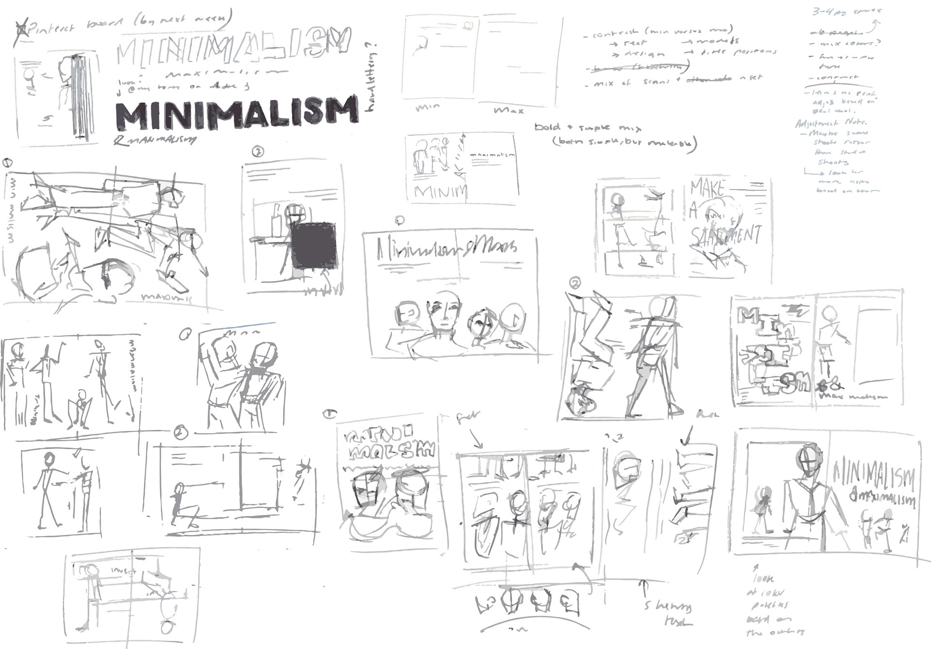
This spread was the first of what I was making, and I had never made an editorial spread before, let alone collaborated with other people to do so. However, I approached it the same way I would any design project by first laying out ideas and concepts, before beginning to sketch them. We didn't have any photos beforehand for this, so I hasn't sure what the material would end up looking like, so my sketches are a combination of possibilities: headshots, material focus, full-body, cross-page, etc. I wanted to have all my bases covered and even if they didn't all help for this particular set of spreads, it did end up helping with the other two sections I also worked on.
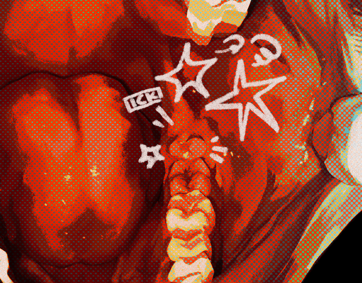
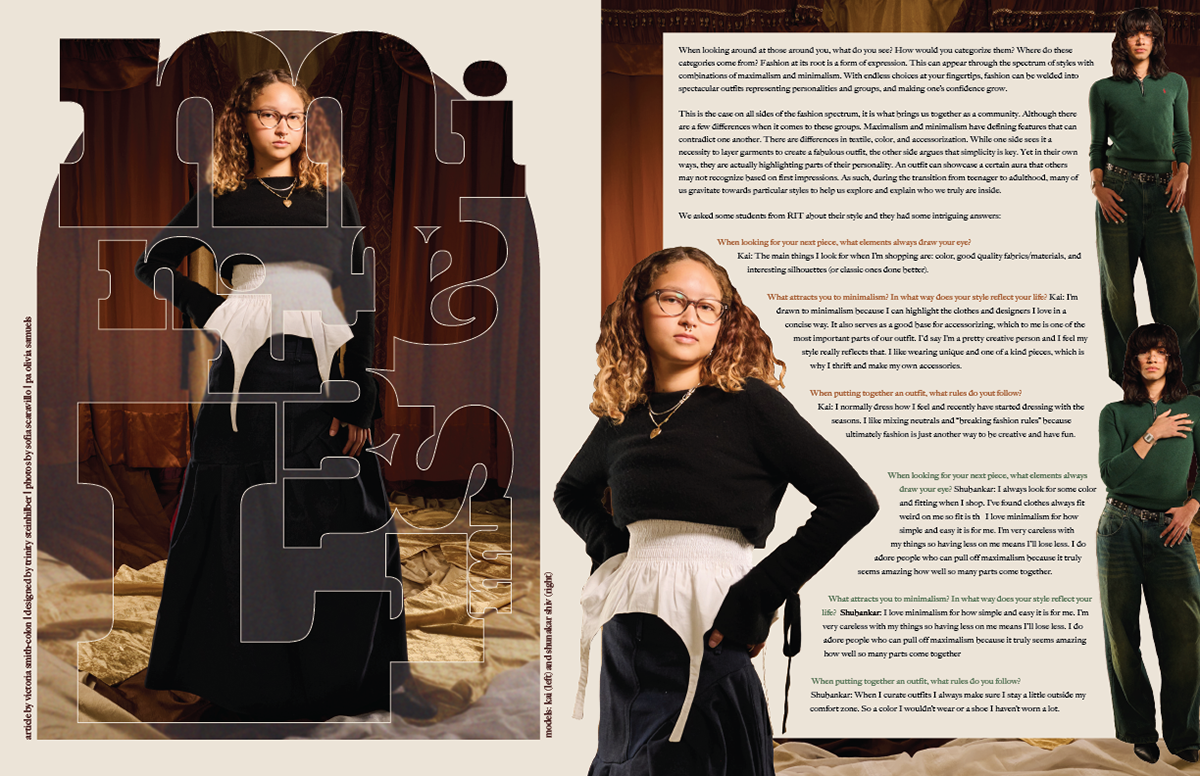
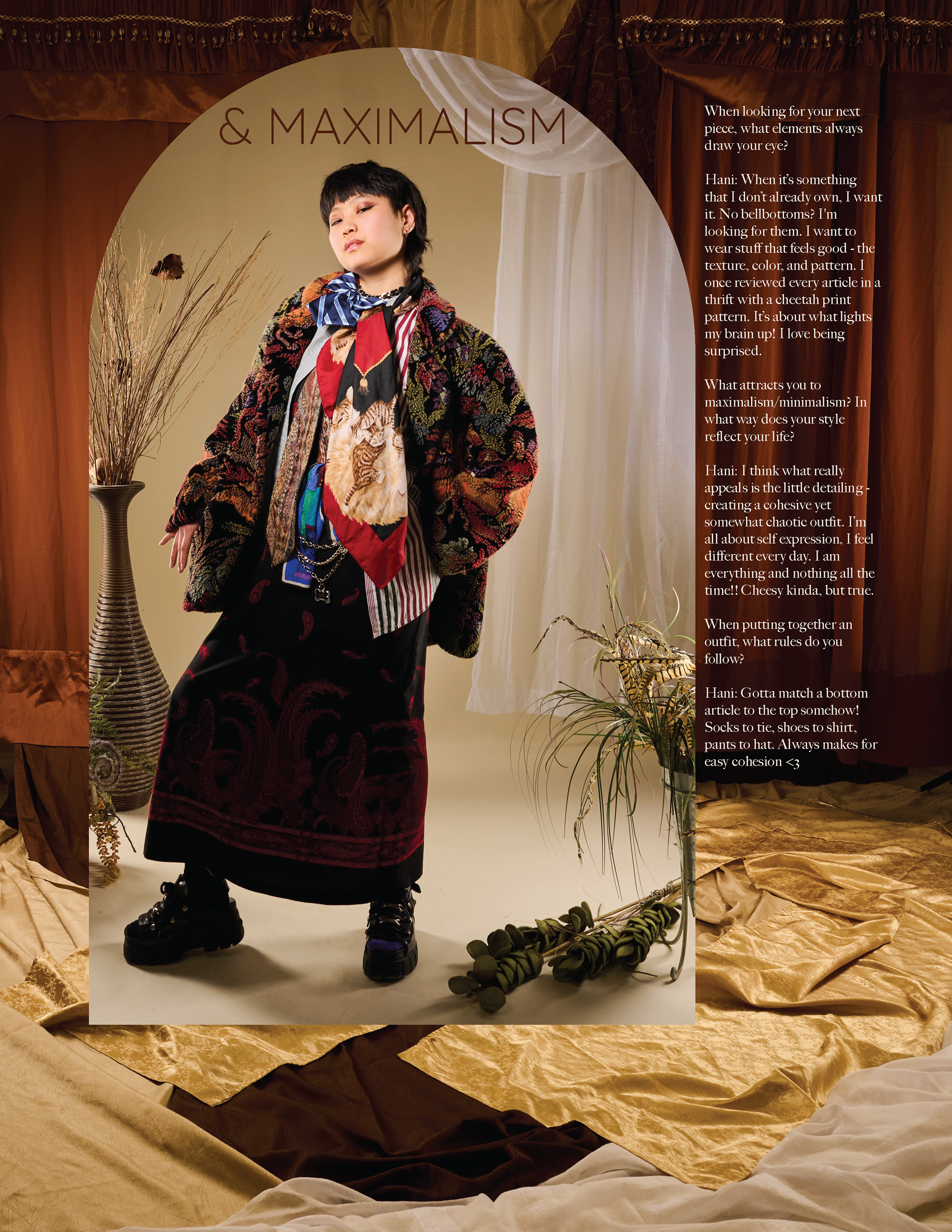
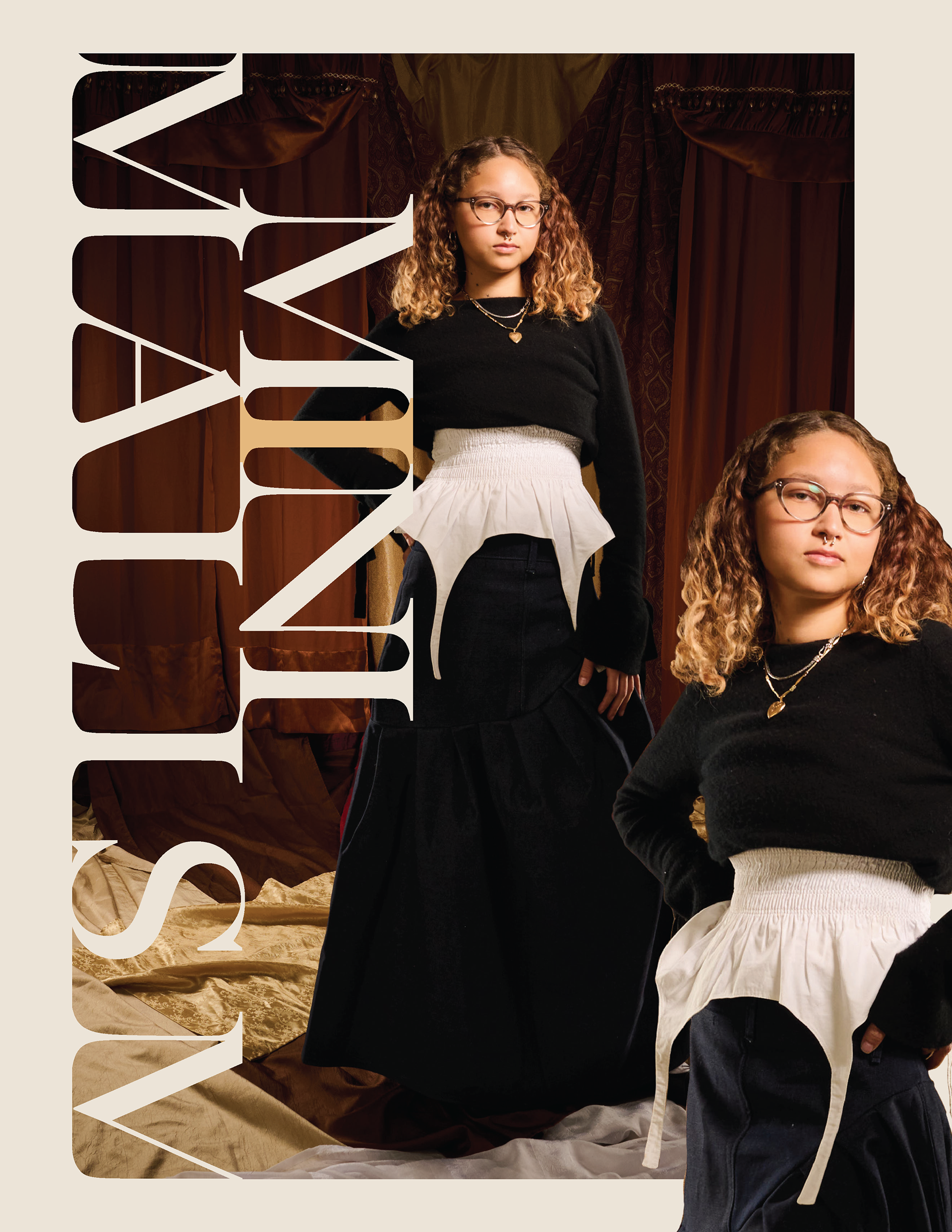
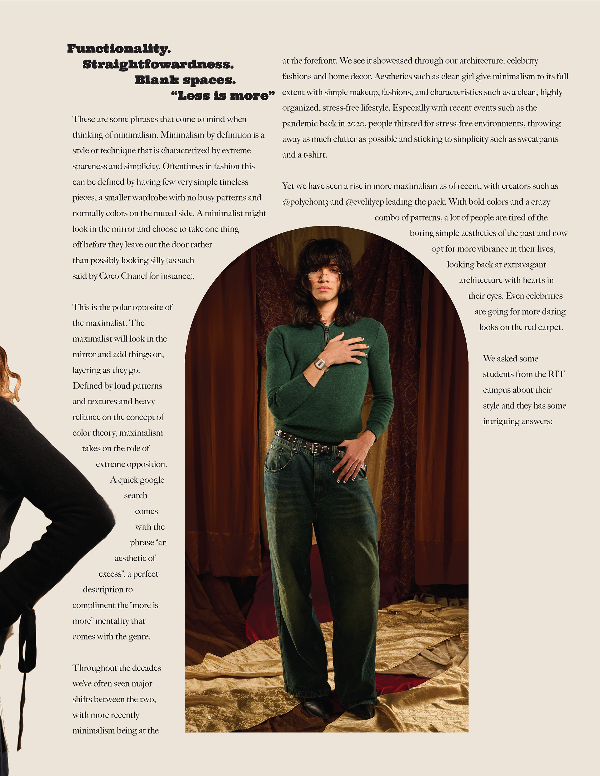
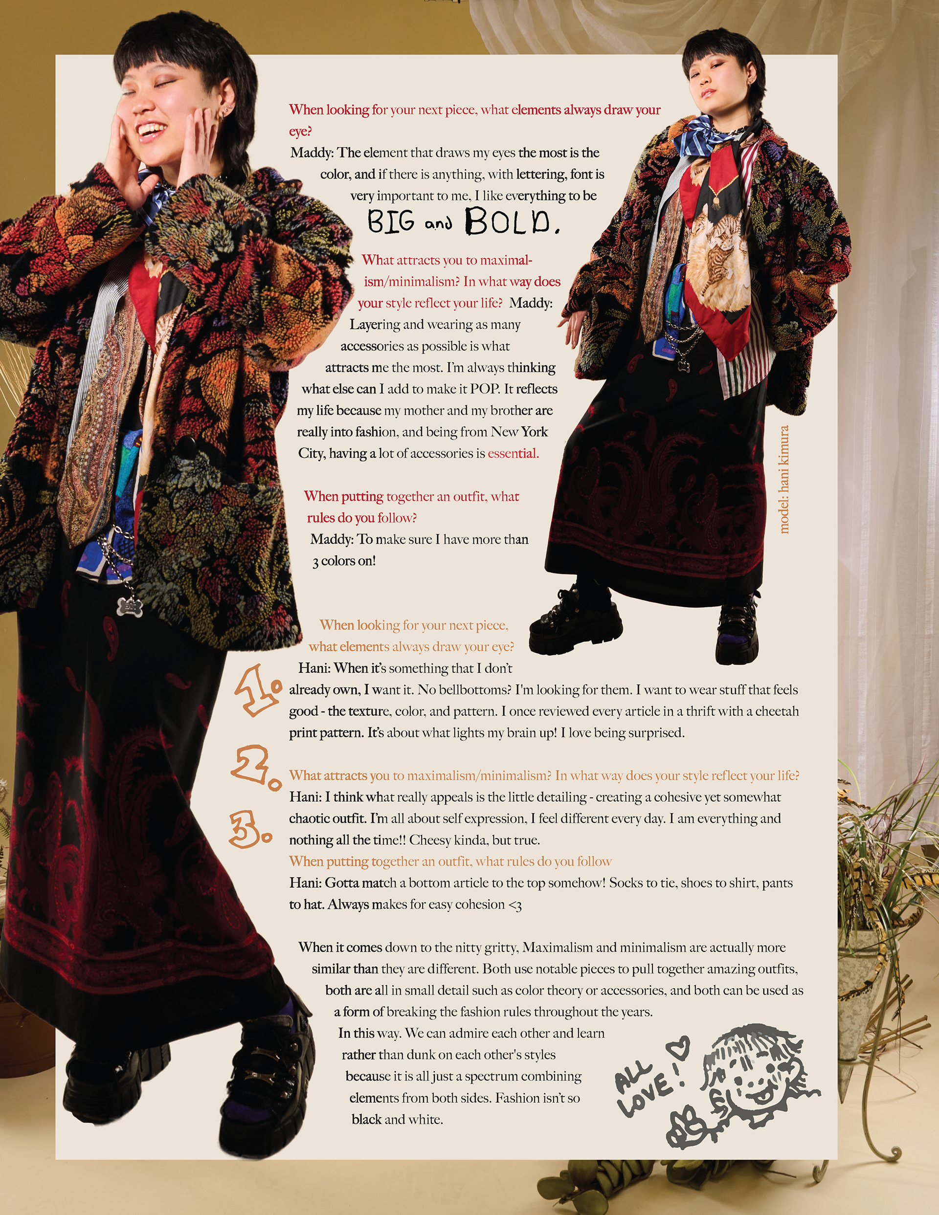
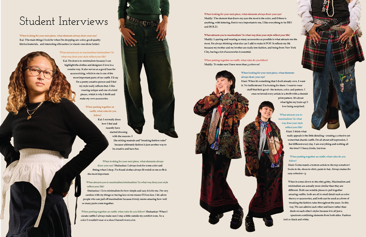
The main focus for this concept was contrast, really laying heavy into how minimalism looks versus maximalism. While working with our photographer, Soph Scaravillo, we decided to have two sets to reflect these contrasts; a simpler, light colored set for maximalism and a dark, heavy draped set for minimalism. With how I presented the models and having the focus be on clothing, I still wanted to implement the wonderful job Soph did on the photos and sets, out of respect for their aspect of the craft.
With this being a student interview section as well, we asked the four student models a series of questions about their outfits and had them write down their answers. I scanned them in and implemented some of their own handwriting into the text-heavy section, trying to balance the visuals and allow for some additional charm. Each student is also separated by a color I selected off of their clothing color palette, letting additional influence seep in. The spreads also follow a similar ironic contrast format, especially in the bookended categories for maximalism and minimalism, where I really played around with the interaction of type and image overlays.

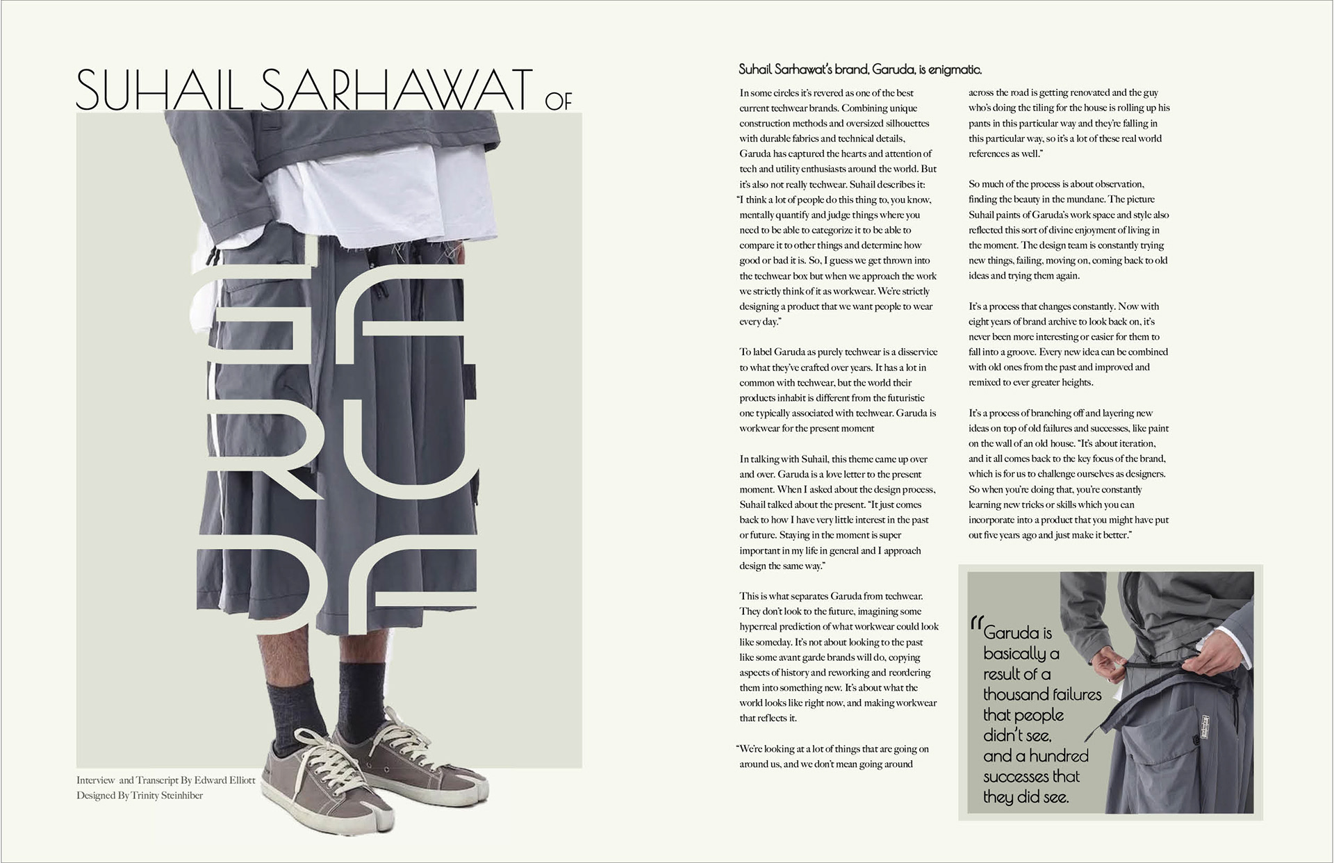
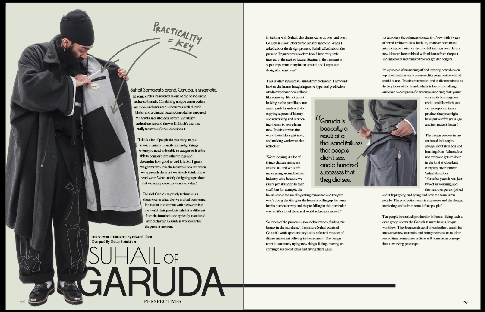
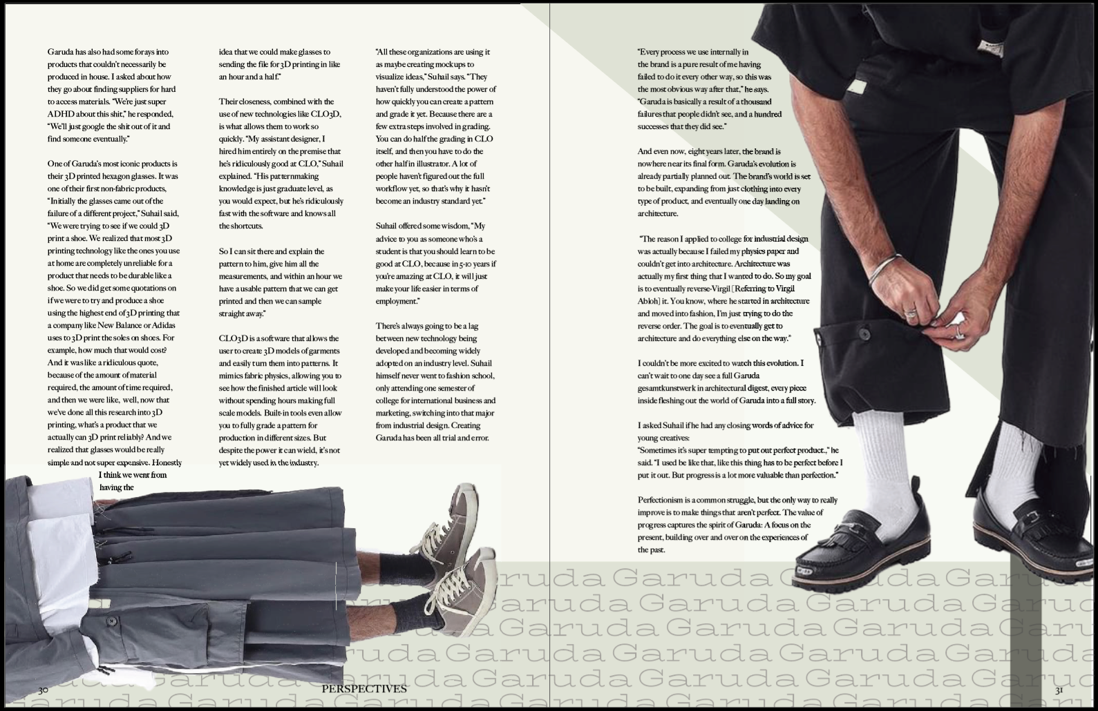
Garuda Interview
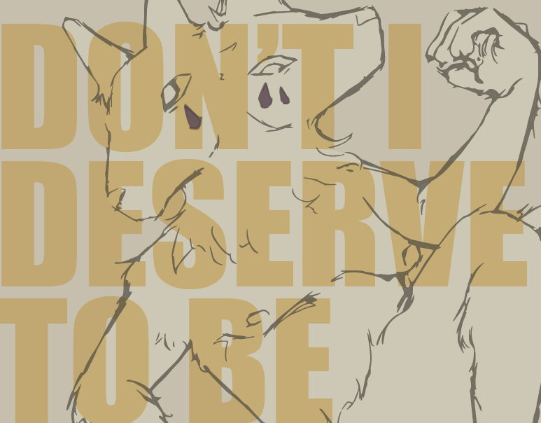
This design brought forth a new challenge: working with pre-existing materials. With the Minimalism//Maximalism shoot, I was able to talk directly with the photographer to gauge an idea for my designs, then adapt as needed in the final. So, I talked with the writer of the article/interviewer, Eddie Elliot, about any ideas he had with the approach. We turned to the Garuda Instagram page and took the photos from those shoots, and even at a lower quality, I started to build up the designs with what I had. Because of this, I didn't really do any sketches ahead of time, especially since I had done that with the previous spread and sort of bounced off of those pre-existing ideas put into new context. So, I kept the more experimental nature that my design had been going in, and built a design around structure and visual practicality, imitating the same goal as the brand and designers depicted.
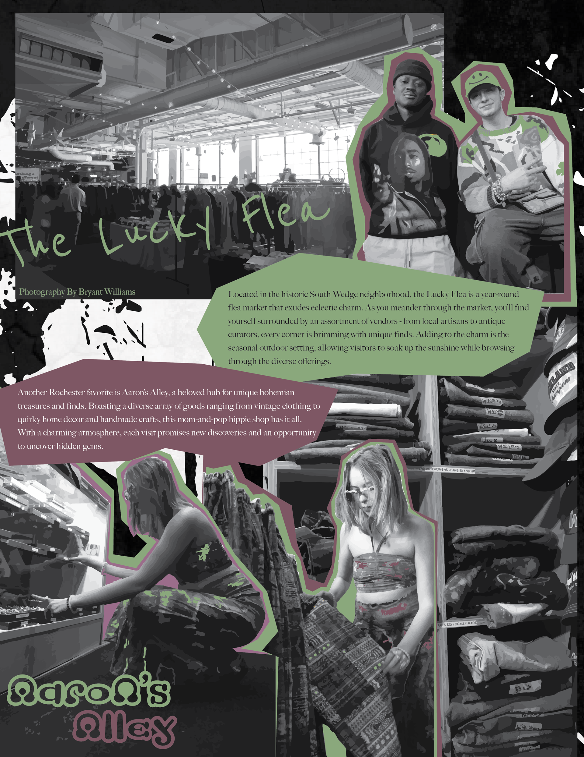
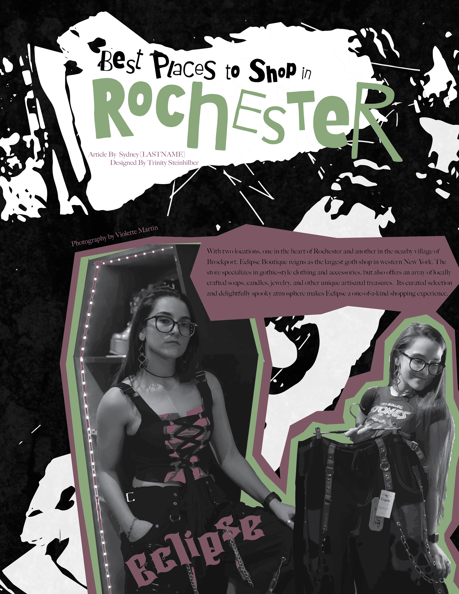
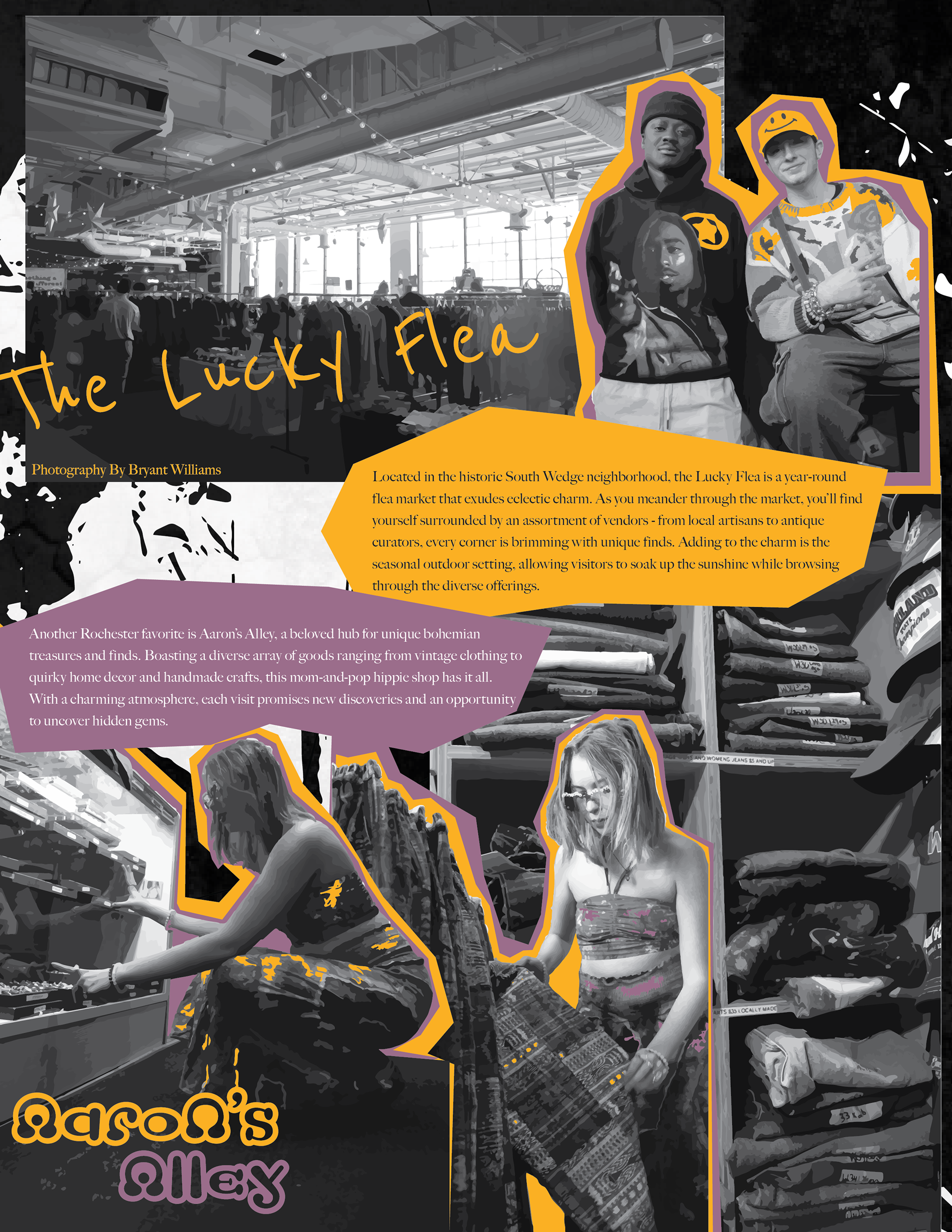
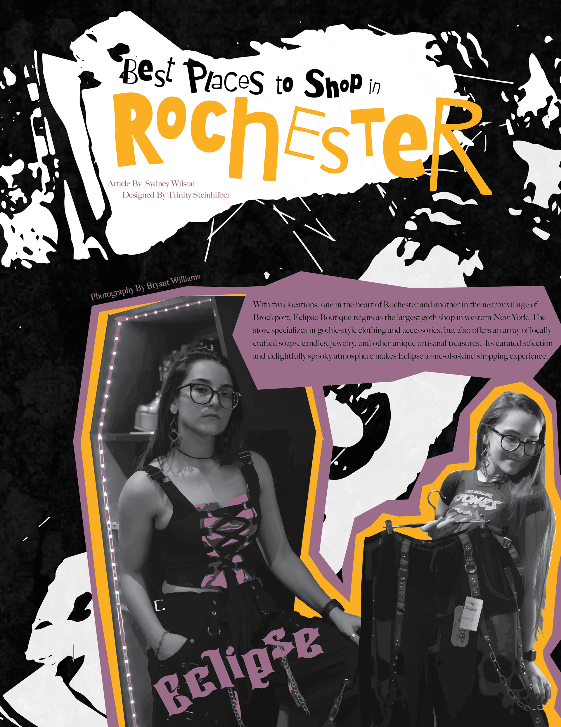
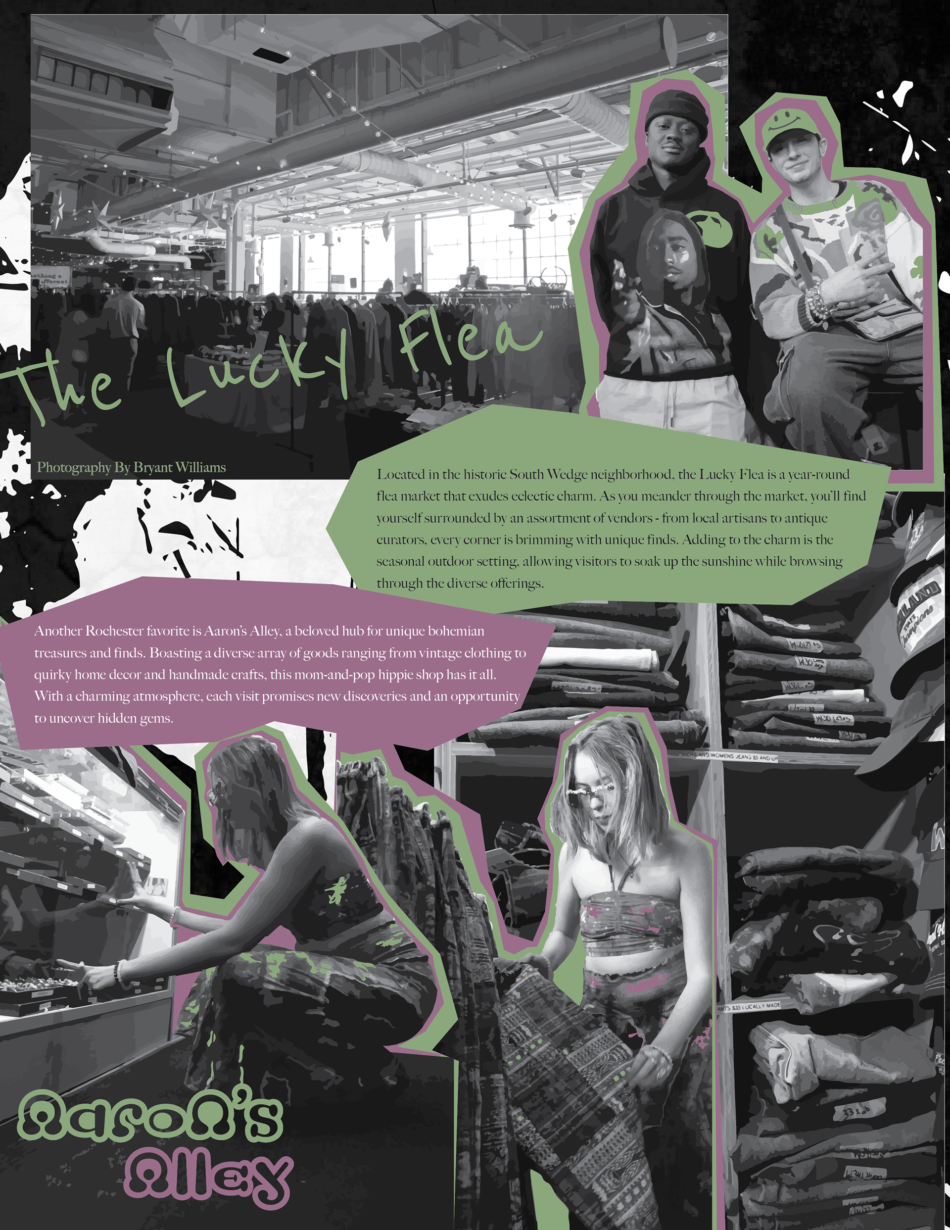
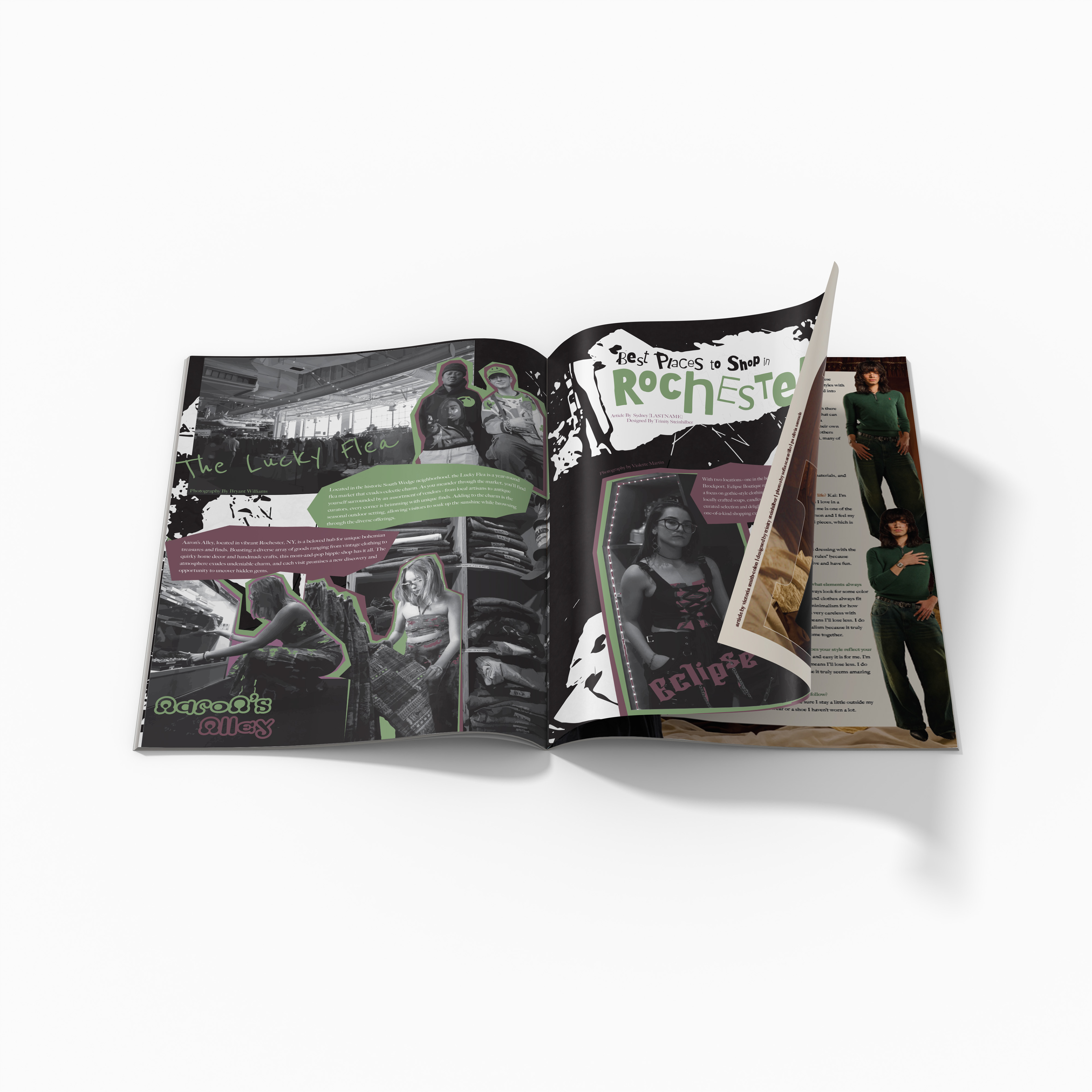
Best Places to Shop
This concept was the most challenging, as it was one I was presented with last minute to design based on a pre-existing concept by someone else. This didn't leave me a lot of time to do things the way I wanted, with a heavier print and scan approach to the design, but I still wanted it to look a little rough. I also didn't have very many text resources to use, so I did my best to allow each location to have a unique quality while also keeping a cohesive theme. I took the images from the two different photographers, Bryant Williams and Violette Martin, and used them as a mix of backgrounds and highlight images (when looking at the models). While the whole thing was not scanned in, I was still able to make the background from a torn and inked paper, then turning on image trace to create and grungy feel, while overlaying other scanned and image traced ink lines I made.